|
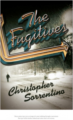
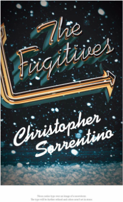
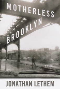
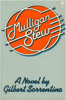
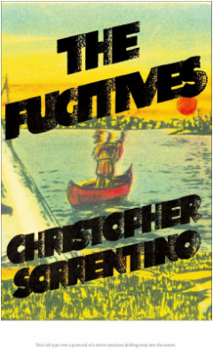
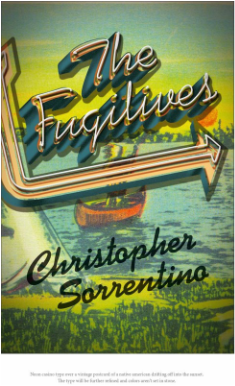
As I should have mentioned in my last post, the final jacket and all other treatments were designed by Jennifer Heuer. She's done a lot of work, involving a pretty amazing range of styles and elements -- illustration, typography, hand-lettering, photography. You can see this conceptual diversity at work in the other jackets she proposed. We'll look at some of them here. I had a couple of problems with these two: Both incorporate a giant snowstorm that takes place at an important moment in the book, but I didn't think that was what ought to be emphasized on the cover. I also thought that the street down which the lonely pedestrian is walking in the image at left looks a lot more urban than it does like a small town in upper Michigan, and that the image itself is a little too reminiscent of the one on the jacket for Motherless Brooklyn: Finally, the typography unavoidably reminded me of this: Back to the drawing board. There were also these: On the left, the type struck me as a little crowded. As for the one on the right, see above. In both, the illustration also struck me as kitschy in the wrong way, up there with tomahawks, totem poles, and wigwams.
The other jackets will follow in part 2. Comments are closed.
|
 RSS Feed
