|
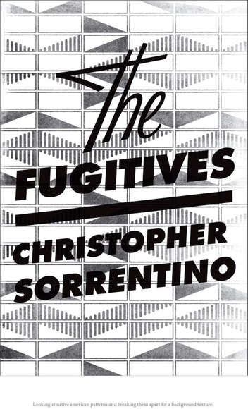
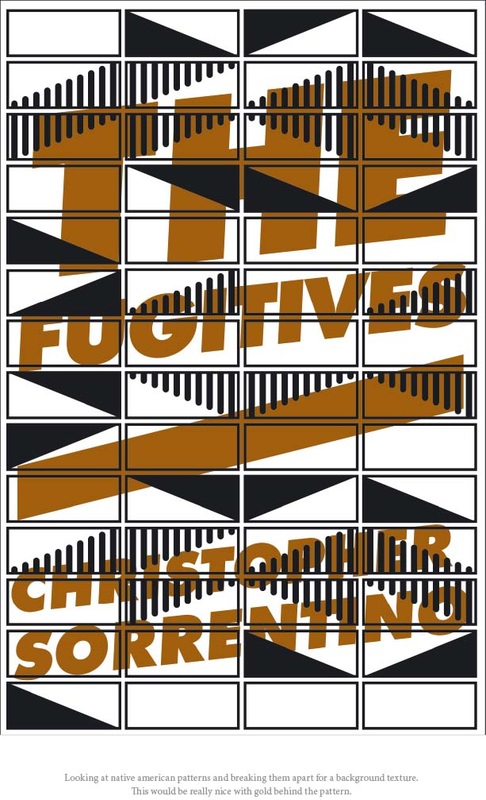
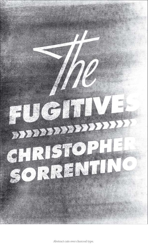
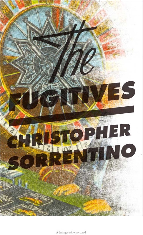
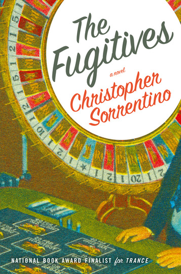
Bound galleys are being made, so that something very much like the book will soon be available in the form of what's referred to as an ARC, or advance reading copy. This gets sent to reviewers, journalists, potential blurbers, and others with varying degrees of interest or disinterest in the book. I thought it was time to put up the second of my two posts about Jennifer Heuer's dust jacket designs. I thought that these two "Indian Blanket" variations were a little obscure, and, in the case of the one incorporating color, difficult to read. I did like the type treatment in the one on the left. The typography pops up again in these two: I was intrigued by the one on the left -- I think it's a great idea for the designer to set aside for another time. The grainy-Xerox-DIY-zine look has definite applications. A redesign of Please Kill Me, perhaps? Alas, "Fugitives" is hard to see, and I already have another junk mail coming to that strange unperson, "Christophe Sorrentino." And if you have an "ethnic" surname, you quickly learn that people find it difficult to spell or pronounce, and you go to great lengths to make it as legible as possible. I was very infatuated with the one on the right. The blown-out look of the image, the boldness of the typography in this particular setting -- it conveys something of the book's own dubiety, and provides a sort of visual justification for the mixing of the two types that I think is lacking in their use on the other designs. I pushed for this one, but agent, editor, and publisher responded more immediately to the one finally chosen. As I said in my prior post, I warmed up to it fast. Speaking of which: below is (apparently) the final version of the dust jacket. The color has been punched up, and jacket copy attesting to the quality of my fiction has been added: Hard to resist the impulse to pick the thing up and flip through it, no? |
 RSS Feed
