|
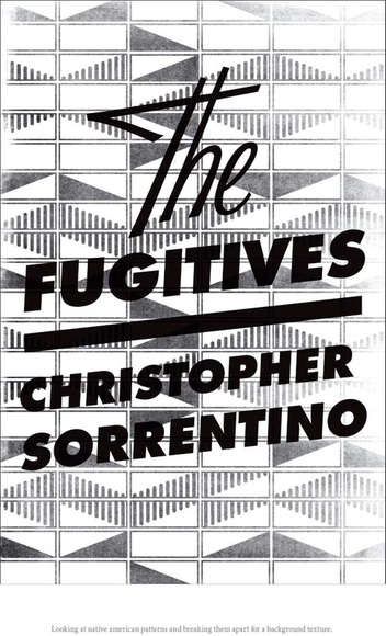
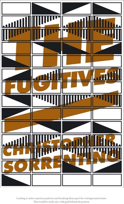
Bound galleys are being made, so that something very much like the book will soon be available in the form of what's referred to as an ARC, or advance reading copy. This gets sent to reviewers, journalists, potential blurbers, and others with varying degrees of interest or disinterest in the book. I thought it was time to put up the second of my two posts about Jennifer Heuer's dust jacket designs. I thought that these two "Indian Blanket" variations were a little obscure, and, in the case of the one incorporating color, difficult to read. I did like the type treatment in the one on the left.
The typography pops up again in these two:
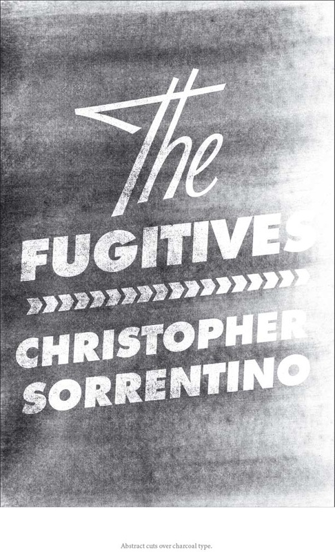
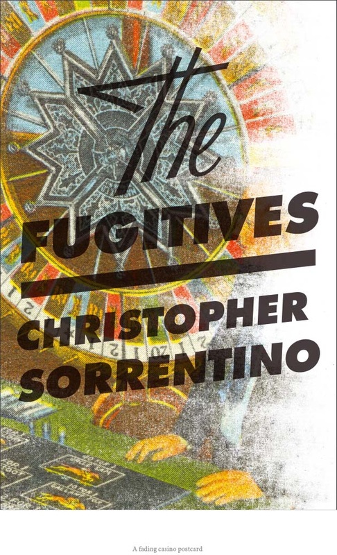
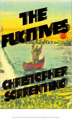
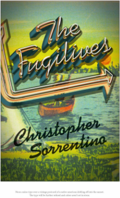
I was intrigued by the one on the left -- I think it's a great idea for the designer to set aside for another time. The grainy-Xerox-DIY-zine look has definite applications. A redesign of Please Kill Me, perhaps? Alas, "Fugitives" is hard to see, and I already have another junk mail coming to that strange unperson, "Christophe Sorrentino." And if you have an "ethnic" surname, you quickly learn that people find it difficult to spell or pronounce, and you go to great lengths to make it as legible as possible. I was very infatuated with the one on the right. The blown-out look of the image, the boldness of the typography in this particular setting -- it conveys something of the book's own dubiety, and provides a sort of visual justification for the mixing of the two types that I think is lacking in their use on the other designs. I pushed for this one, but agent, editor, and publisher responded more immediately to the one finally chosen. As I said in my prior post, I warmed up to it fast. Speaking of which: below is (apparently) the final version of the dust jacket. The color has been punched up, and jacket copy attesting to the quality of my fiction has been added: 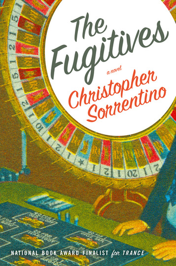 Hard to resist the impulse to pick the thing up and flip through it, no? As I should have mentioned in my last post, the final jacket and all other treatments were designed by Jennifer Heuer. She's done a lot of work, involving a pretty amazing range of styles and elements -- illustration, typography, hand-lettering, photography. You can see this conceptual diversity at work in the other jackets she proposed. We'll look at some of them here. I had a couple of problems with these two:
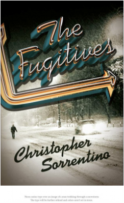
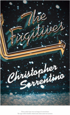
Both incorporate a giant snowstorm that takes place at an important moment in the book, but I didn't think that was what ought to be emphasized on the cover. I also thought that the street down which the lonely pedestrian is walking in the image at left looks a lot more urban than it does like a small town in upper Michigan, and that the image itself is a little too reminiscent of the one on the jacket for Motherless Brooklyn: 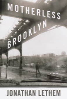 Finally, the typography unavoidably reminded me of this: 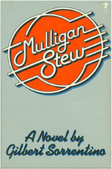 Back to the drawing board. There were also these:
On the left, the type struck me as a little crowded. As for the one on the right, see above. In both, the illustration also struck me as kitschy in the wrong way, up there with tomahawks, totem poles, and wigwams.
The other jackets will follow in part 2. The Fugitives is officially publishing on February 9, 2016 and can now be preordered on Amazon.com, BarnesandNoble.com, and booksamillion.com. Or you can visit indiebound.org, where you can obtain a list of independent bookstores near you -- then you can ask them to stock The Fugitives and any other titles you'd like to buy close to home. Here's the book description: "The much-anticipated new novel by Christopher Sorrentino, acclaimed author of National Book Award finalist Trance—a bracing, kaleidoscopic look at truth and fiction, love and obsession, loyalty and betrayal, race and identity, chaos and free will. Sandy Mulligan, a successful writer in the midst of a personal and creative crisis, retreats from Brooklyn to the quiet Michigan town where he hopes to finish a novel and to escape his turbulent private life and the scandal that’s maimed his public reputation. Once there, he becomes fascinated by John Salteau, a native Ojibway storyteller who regularly appears at the local library. But Salteau is not what he appears to be—a fact suspected by Kat Danhoff, an ambitious Chicago reporter who arrives to investigate a theft from a local Indian-run casino. Salteau’s possible role in the crime could be the key to the biggest story of her stalled career. Bored, emotionally careless, and sexually reckless, Kat immediately attracts a restive Sandy. In their growing involvement with one another, each becomes a pawn in the other’s game. As we weave among these characters, learning about their lives and motivations, and uncovering the conflicts and contradictions between their stories, we realize that the storyteller is not the only one with secrets to conceal; that all three are fugitives of one kind or another. All the Sorrentino touches that have thrilled admirers are here: sparkling dialogue, satirical wit, attention to the details of everyday life, dizzyingly inventive prose—but it is the deeply imagined interior lives of its all-too-human main characters that set this novel apart. Moving, funny, tense, and mysterious, The Fugitives is a love story, a ghost story, and a crime thriller. The Fugitives also is a cautionary tale of twenty-first century American life—a meditation on the meaning of identity, on the role storytelling plays in our understanding of ourselves and each other, and on the difficulty of making genuine connections with others in a contemporary world that’s connected in almost every way. Darkly satirical, exuberantly enigmatic, and completely unforgettable, The Fugitives is an event that reaffirms Sorrentino’s position as an American writer of the first rank." Once a publisher puts a novel into production, the process is pretty quick -- or maybe it just seems that way as soon as a novel starts looking more like an actual book and less like a manuscript. While The Fugitives still has to undergo really essential stuff like copyediting and proofreading and interior book design and the gathering of blurbs and so on, there have already been a bunch of cover treatments to look at, including this one, which I believe is pretty close to whatever will end up as the final design: 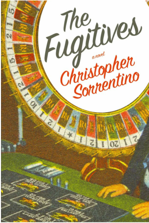 I'd asked if the designer would consider a typeface that reached back to the display types frequently used in dustjacket design of the thirties and forties, particularly ones that conveyed movement and momentum. This script (I'll put up a post identifying it when I find out more) does a nice job of translating my somewhat vague request while also seeing beyond the admittedly cliched examples of period typography I submitted to try to demonstrate my idea: another demonstration that graphic design is best left to graphic designers. The image -- taken from a vintage postcard -- has a nice retro feel; the casino iconography fits the book (see the description above) while avoiding the sort of tired imagery I was dreading. I confess that when I first saw the title and my name spread across the white space superimposed in the middle of the wheel of fortune, my first thought was "birthday cake." But I quickly warmed up to the design. I'll post some of the other treatments in another entry soon.
|
 RSS Feed